As I mentioned last week, I recently launched a Kickstarter to make silkscreened children’s posters. I thought I’d talk a little bit about how I designed them.
The idea came from a doodle in my sketchbook. I like to draw animals, and the Olympics were coming.
And I knew I wanted to make some posters. I wasn’t sure whether I wanted them to be silkscreened or offset printed, but I didn’t really need to know that to start designing, because I did know this: I wanted the images to be printed in a series of flat, overlapping colors.

Photo: Biscarotte.
Some printing context.
Silkscreen, a process for printing by hand, involves pushing ink through a tightly stretched mesh fabric, where some areas are uncoated, so ink can go through, and other areas are blocked, because they are coated with a photo-sensitive emulsion. As with all printmaking techniques, you create one screen for each color and print them one at a time.
Offset printing, a machine process, is the way most things are printed. In general, color images to be offset printed are scanned and digitally separated into cyan (C), magenta (M), yellow (Y), and black (K)* components.** These four separations are then printed with four plates, one for each ink, in overlapping halftone dots. You’ve probably seen what those look like:
BUT. Offset printing doesn’t have to be done in CMYK or in halftones. You can use any colors you want, and you can print them in big solid areas, just as you would with a handmade print.***
Each technique has its advantages. Silkscreen prints have a more tactile quality. Slight imperfections, like ink texture or a bit of mis-registration, are part of their beauty. Because prints are pulled one at a time, silkscreen is appropriate for small print runs. You can print on almost any surface, like fancy art paper, or wood, or fabric.
Because it’s done on a machine, offset printing is more exact. You can print very fine details with perfect registration. The prints are completely smooth and even. Offset printing is economical when done on a large scale.
I think both are beautiful, and my designs would have worked in either method. I chose silkscreen because I wanted its characteristic handmade look. Silkscreen also made more sense for this project because I am making art prints in small quantities. (Offset printers prefer print runs in the thousands.)

Sketchbook notes from when I learned how to silkscreen. The diagram shows how to place the screen on the exposure unit. I studied printmaking in Germany, so my notes are in a mixture of German and English. Which is kind of hilarious.
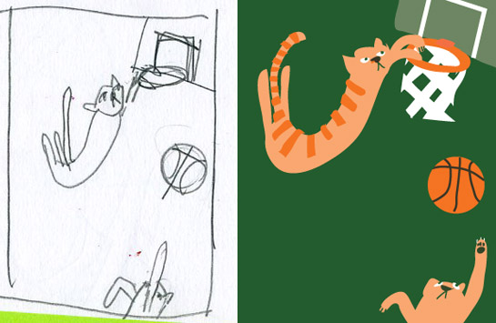
Back to my design. I’ll continue with the cats as my example. Somewhere early on, while I was brainstorming different animals and sports, I decided that cats playing basketball would be funny because of the way cats jump and twist and bat at objects. I made some really rough sketches.
Using my thumbnail as a guide, I started drawing in Illustrator. Unlike in Photoshop, where images are made of a grid of pixels, images in Illustrator are made of outlines, each defined by a series of points and filled with a color: perfect for drawing flat shapes. I used my Wacom tablet and the pencil tool to rough out the forms.
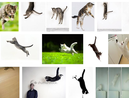
I decided I wanted a better understanding of how cats move. Getting the poses right required research, which meant I had to go look at cat pictures on the Internet.
Then more sketches, first in pencil, then in Illustrator.
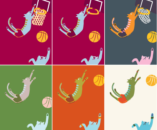
After that, it was a matter of iteratively refining the Illustrator drawing. I would go in, change some colors or tighten some points with the pen and direct selection tools, and save a new file. I did this about twenty times. At some point, I took out the basket and backboard because I decided they were too distracting.
There was a long period where I felt I didn’t know a thing about how to use color. I once asked an illustrator professor of mine, Nancy Stahl, how she did it. She said that she just kept trying combinations until she found ones that sang. At the time, I found that statement annoyingly vague, but it’s turned out to be an extremely useful piece of advice. (A little color theory and a lot of practice haven’t hurt, either.)
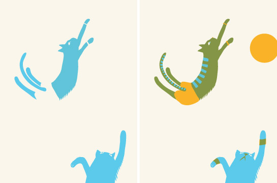
 In the case of screen printing, your palette is usually limited, because each additional color means burning an extra screen and registering and printing another layer of ink. But one magical thing about printmaking is the way colors mix when you print one transparent layer over another. Even if you just use three inks, you can get eight colors: each one by itself, three pairs of two colors, and all three together, plus the color of the blank paper. Mixing colors this way tends to harmonize your palette.
In Illustrator, I used just a few fill colors, with my layers set on Multiply. At the beginning, I found it easier to draw freely, without regard to how my layers were organized. Eventually, I used Select > Same > Fill Color to group my shapes into layers, one for each color. That made it easy to play around with color changes, and those layers became my color separations for printing.
Here is how I will print them, on a creamy-colored paper. First the light blue, then the dark yellow…
…and finally, the pink.
And that’s it!
—
*I don’t know why it’s not CMYB. Maybe because it seems like B would be for Blue?
**Not all colors fall within the CMYK gamut! You can’t just paint any color and expect it to be printable with these four inks. Certain bright greens and oranges don’t reproduce well, for example.
***You can also silkscreen with halftones, but the results are lower fidelity because exact registration is more difficult, and because the weave of a mesh screen has a lower resolution than the emulsion on an offset printing plate.





Great post! Thank you Liz!
LikeLike
Eee! Cat basketball! So much fun, what a great project Liz.
LikeLike