Ruthie, Robin, and I decided to make a bunch of pig drawings to adorn our new logo. For me, this little project was a chance to play with different styles.
This first one is a combination of hand drawing and Photoshop. I started out with colored pencils and crayons. Because it was an experiment, I didn’t overthink things.
Then I used a mask to give the pig a cutout look and better define the eyes.
I filled the pig with extra pink, set on “Multiply”…
…and added extra bits of color to give the piggie’s body more dimension.
I also drew this weird little grandpa pig. (Like I said, I was experimenting.) It’s colored pencil with digital color.
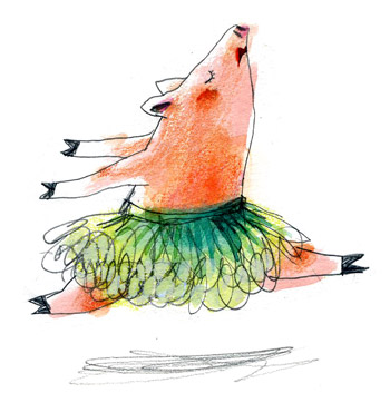
And then these three, done in pencil, watercolor, and colored pencil, are more in my usual style.


They are all neat in their own ways — but the last set really sings. Must be because it’s your usual style and it’s in your comfort zone. Or maybe it’s just that I prefer that look. I love the colors! The dancing piggie is the best!
LikeLike
Thanks! That dancer is my favorite, too. 🙂
LikeLike
The pirouetting pig is great!
LikeLike