Recently I got a chance to talk with Dan Santat about his latest picture book, The Adventures of Beekle: The Unimaginary Friend. There are so many things I love about this book and Dan generously gave me some serious inside scoop. Read on for a detailed behind-the-scenes look into the making of this beautiful and thoughtful story.
Robin: I saw the book trailer for Beekle before I saw the book and loved it. Beekle is totally ready for the movies!
Dan: Thank you! My agent, Jodi Reamer at Writers House, shopped Beekle around and DreamWorks actually optioned the book before I got the book contract. A lot of film companies inquire at Writers House to see what kind of properties they have. They requested to see me because they had seen a picture book I had done a few years back. We finally had a chance to meet and I pitched the idea for this book. They liked it and then two weeks later they made an offer.
Robin:That’s so cool! What is your role going to be in the movie?
Dan: I’m solely a creative consultant. I know quite a few guys that work there and I know the beautiful work that they do. I’ve gotten advice from other friends who have said the best thing to do is just take the option and then stand back and let them do what they do.
Robin: Tell me more about creating the book.
Dan: This was one of the most intimidating projects I’ve ever done. There’s a metamorphosis from uncertainty to knowing exactly who you are which was very personal to me. The main character, Beekle, is a blank slate. His purpose isn’t entirely clear. As he goes on this journey, he’s worried: am I doing the right thing? In the first version of the book, I focused on how life experiences define who you are. My editor thought that was more of an adult theme and that we should talk about friendship, about making your first friend. I loved that idea.
On my son’s first day of preschool he had all of this anxiety. What are the other kids going to be like? Are they going to like me? Am I going to find anybody that wants to be my friend? I remember telling him: be yourself. You don’t need everybody to like you, you just need to start with one friend. I hope a kid reading this book gets the idea that friendship is out there. You don’t have to really look for it because chances are someone is also looking for you.
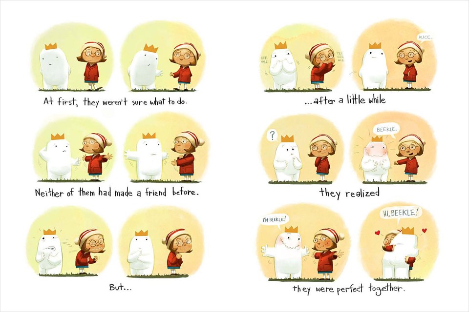
A spread from Beekle where Beekle and Alice meet for the first time.
Robin: Tell me about the world-building in the story.
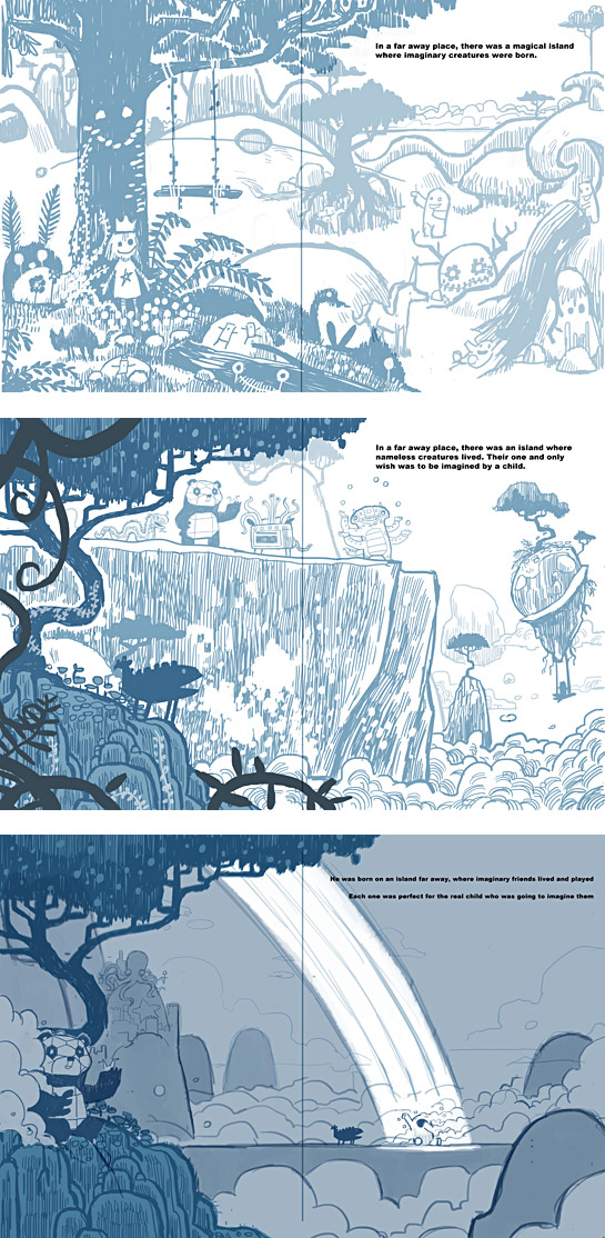
The most intimidating part of this book was the first spread, the imaginary world. What would a world where imaginary friends come from look like? I remember doing all of these huge landscapes—all of these grassy knolls that were shaped like slides—it almost felt cliché. Every time I drew it, it always looked like I was trying too hard to be fantastical.
I even did a couple of final pieces that way. I actually said, okay, that’s the way it’s going to look and then I painted it. I remember in the back of my mind thinking that it didn’t really feel right.
Then my editor, Connie Hsu, made a text change. She suggested that rather than saying, “He came from an island where imaginary friends were born…” maybe it should say “He was born on an island… .” And then she said, “Could you show us a picture?”
I remember I just stressed out. Why are you asking me to do the one thing that I don’t want to do? I had already done eight different compositions. Then I decided I should focus more on him being born than on the world. I decided to just show enough of the world that it felt really fantastic. He’s born from a rainbow and a cloud. It’s just rocks and clouds.
I wanted the imaginary world to feel warm and inviting. The book is also a metaphor about the birth of my son. The first time that my wife held the kid, friends and family around us. I wanted that first spread to feel like that, like oh my gosh, he’s here, you know?

The final opening spread from Beekle.
Robin: Right, it’s like a celebration. It’s so effective. You have these gorgeous imaginary creatures and it’s like they are in this fantastical waiting room. You have just enough there that makes it feel like fantasy.
It sounds like you worked very closely with Connie on the text. Tell me more about how you worked with her on this project.
Dan: Typically when I do a book, I’ll write everything out and then I’ll illustrate it but in this case there was a lot of push and pull. I would draw one thing and tweak the text and then I would let Connie read the text and she would tweak that and then I’d end up tweaking the drawings again.
Picture books man, they’re so hard. Connie was very hands-on with helping me with the writing. Just changing a couple of words here and there was huge. We would change one word in a spread and then it would create ripples throughout the entire manuscript. It was really delicate. I knew what my weaknesses were so I followed her lead. In the end it’s a much stronger book than what I had originally thought of.
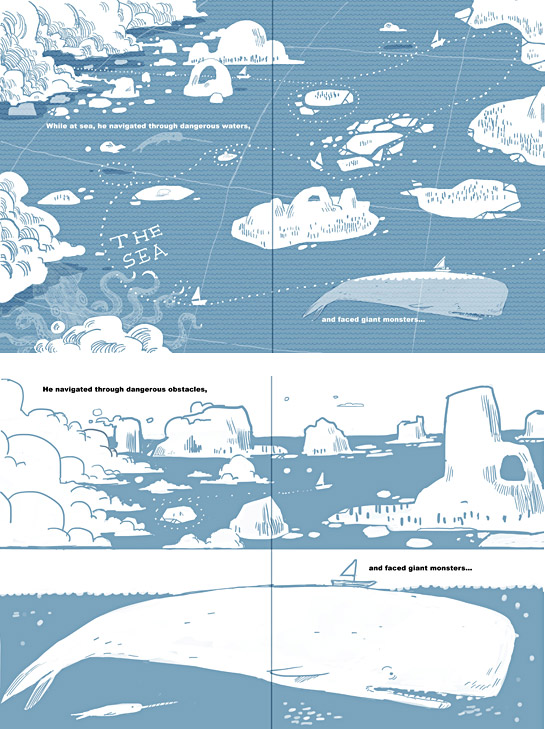
“There was a part of me that was so in love with the journey part of the story. I had all of these ideas of him on this boat and Connie said, ‘We get it!’ One spread! You get one spread. I originally did this whole huge spread of his journey. I thought I’m going to show you. I’m going to incorporate it all into one spread. She said, it’s a little much, let’s just do the whale, the whale is good, you know?: ‘…faced many scary things.’”

The final spread representing Beekle’s journey.
Robin: How did you come up with the ideas for the characters on the endpapers?
Dan: I always knew that the endpapers would be a line up of kids with their imaginary friends but I was really intimidated. In the beginning I was just doing all of the beautiful sailing landscapes with just Beekle. At a certain point I realized I had to start filling pages with the other imaginary friends. All of the pages that you see with imaginary friends came towards the end.
I like the concept of an imaginary friend because it is an intention: who is the perfect friend for me? If you are an imaginary friend you only exist because someone thought of you, right? I wanted the imaginary friends to be grounded in something familiar and I wanted their purpose to be clear without having to write it out.
The endpapers actually took me about a week to figure out. I would sit there for hours and I would just think and say, no, no… Once I filled that page of imaginary friends I was running empty on the tank. I decided keep the cast relatively small and to have the same characters throughout so that the endpapers are like a glossary.

The endpapers for Beekle: “There’s a kid with a guitar and then his best friend is this little monster that lives inside a bongo drum. He just beats himself in the head. For the longest time I kept trying to think of some amorphous character with piano key teeth or a snail that had a shell that was shaped like a French horn. It just got a little too weird when you looked at it. I didn’t want these to be aliens or variations of furry beasts. I wanted these to be imaginary friends.”
Robin: Did you do a lot of character studies? You knew you wanted an octopus so you drew 20 octopi and…
Dan: I’m really bad about that. I do all of that in my head. Since I’m a parent, a lot of my time is spent either walking the dogs or cooking dinner or doing laundry or taking the kids places. I don’t have time to fill a sketchbook. I hate to admit this but I’m actually figuring out character designs while I’m doing the final artwork. It’s burned me a couple of times. I’ll draw something and then maybe in another spread I’ll add something to that character or change it and I’ll like it a lot better, and then I’ll have to go back to the earlier artwork and change that. For some reason it doesn’t feel like I’m wasting my time when I know that it’s for the purpose of being a final piece.
Robin: How does that process work with your art directors and editors? Isn’t there usually that phase in the process where you say here are my characters and then there may be some back and forth with the art director? Are they cute enough? Are they too cute? Are they old enough/young enough? Does that still happen when you’re handing in your sketches or do you work with art directors that are more hands off, or that have faith in you to get it right at the end?
Dan: I think a lot of people realize that I probably do my best work if I’m free to go do my own thing. That said, I always like to deliver more than what the publisher will expect, I think that’s just good business practice but it’s also good for me to push myself. You always want your next book to be better than the last one that you did.
If I’m working on a series, or if it’s an editor or an art director that I’ve never worked with before, they’ll usually want to see what I have for designs. Then after that I just take it from there, but I’m always open to art direction.
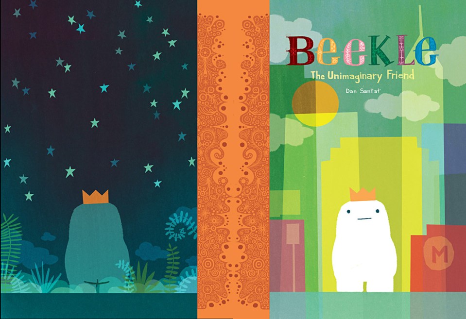
The case design for Beekle by Dan Santat.
Robin: I love that Beekle is hand lettered. It’s such a nice addition.
Dan: I’m constantly trying to push myself to get better at typography because I find that if it all comes from the same hand it feels more immersive. It started with the covers. I did a picture book called Chicken Dance and just ran with it. I decided I was going to make the cover comp so good that they couldn’t deny it. I know where my limitations lie so if I do a type treatment and they don’t think it’s working then I’ll back off.
With Beekle I felt that the handwriting portion of it was important because I wanted it to feel like this was something that was made by the girl in the story. There was a point where I even wanted the drawings to be really loose and naive, almost like it was drawn by a five-year-old. I couldn’t get myself to do it. It probably would have made the message even stronger when I reflect on it but at the same time I thought it didn’t feel finished.
Robin: That would have been a little more expected so I’m glad that you didn’t do that. This feels like what’s in her head as opposed to coming from her hand. I think that style would have gotten in the way a little bit.
Dan: Drawing style was something that was a big part of this book. For the past eight years I’ve primarily used Photoshop for all of my books, but with this one I integrated paint textures and charcoal textures. It was important for me to get that handmade feel into it.
Robin: Alright, so I’m going to make you get technical here. You’ve got your pencil sketch and then what is your process? How did you create the finals?
Dan: I think this might be a popular trend that’s happening these days in illustration. I take a sheet of paper and then I just try to make really beautiful watercolor marks and interesting textures. Then I take another sheet of paper and fill that up with charcoal, another with color pencil, another with acrylic. I scan all of those papers in and I end up with these huge Photoshop files of pure texture. I take my tight pencil drawing and layer the textures on top. I create alpha channels on those textures and draw with that. It’s almost like I’m cutting out the shape of the thing that I want to create using that texture rather than a Photoshop brush. That way I’m incorporating that handmade feel with the computer.
I’m starting to build a library of different scanned textures and materials that I can pick and choose from. I think Jon Klassen and Peter Brown do it as well and it’s something I’d experimented with before. I wanted to take this approach for this book because I felt like it was integral to the story of this girl making a book. I was thrilled with the end results.
Robin: It’s beautiful.

A final illustration for Beekle: In this scene “the ground was a color pencil texture overlaid with a watercolor texture. I could probably do that conventionally but here I’m doing it on a computer and I think you get the same results.”
Dan: I don’t know if I’ll be able to have the time or the computer memory to do my next book. Each texture file is around 80 megabytes so when you layer them some of these files got up to around 5 gigabytes. I can just feel my computer…
Robin: …Groaning and buckling…
Dan: Right. It got to a point where I tried to scale something and my computer would just shut down. I would get really stressed out: I need to scale this so I have to save my file first and then scale it! It was terrible.

The final dragon spread in Beekle. “Each spread took me about a day to do. The dragon spread took me three days because I painted each scale on the dragon individually. I remember thinking this is going to suck but in the end I think I’m going to be really happy with the result. I’m really glad I did it.”
Robin: Tell me about your color palette. At any point are you formally putting together swatches for your palette and saying these are my yellows, these are my blues or do you just have your go-to colors that you like?
Dan: I’m not that rigid about it. In art school, we would have guest lecturers come in from DreamWorks and talk about how color can completely dictate the mood of a scene. A purple sky can feel very dark and ominous. If we change that sky to a yellow then it feels young, refreshing, optimistic. When you study all those DreamWorks films you see it! To this day I find myself referring to certain color palettes because I know from past experience what kind of emotions those particular colors will convey when I use them in the right scene.
When I came out of art school I found my color palette was the hardest thing to master. Color in general can be so daunting grasp. There is an infinite number of colors, which ones should I use?
I threw out my whole portfolio and decided I needed to get a better control of color. One of my friends who was a really excellent designer just said, start simple. Start with two or three colors and then try to do an entire piece with just those three colors. When you’re doing a lot of color mixing you’re going to find that all of those colors harmonize together. That’s what makes the piece so much stronger: All of the colors inherently relate to one another because you’re mixing those properties into the whole thing. I started with that and then I’d add a fourth color, a fifth color, and so forth.
When I create illustrations on a computer I have more opportunity to experiment, take more risks, and to really tighten up my sense of color. I noticed over the years that there are certain colors I gravitate towards, like mustardy yellow. My skies tend to be dark turquoise. But sometimes the mood of a scene might be better depicted by a slight shift on a color bar. Honestly, I feel like if I were given a palette of paint and a paintbrush it would take me forever to mix the color. With the computer I can figure it out in minutes.
I do have one horrible quirk and I hate to say it, I loathe purple! It’s not to say I never use purple but when I use purple it always feels awkward. Purple is like the color theory’s Helvetica. It is very powerful if someone knows how to use it but everyone uses it wrong!
That’s not to say that I’ve never used it—one of the monsters in the beginning is purple—but I think one of the strengths of this book is that the palette is really tight.

A spread from Beekle by Dan Santat.
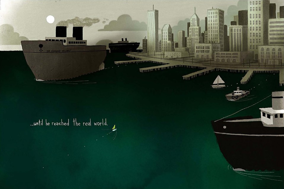
“I tend to push my darks and lights. I learned this from my experience working in the video game industry. If you were to make something in 3D without it being lit it would look horribly dull. Lighting is like 90% of the whole thing.”

“Everything creative in the book is done in really saturated, fun color and anything that relates to the real world is very stark. This is one of my favorite spreads. To take it upon yourself to go out into the real world is really scary, it’s a dark real world where everything is just gray and adults are really intimidating. I wanted the imaginary world to feel more secure than the real world itself. As a kid I think there’s this comfort of being in your imagination.”
Robin: So where did the name Beekle come from?
Dan: When my son was first learning to speak his word for bicycle was Beekle. My wife said that would be a really great name for a character and I thought, yeah, that is a pretty excellent name.
Thanks Dan! To see more of what Dan does check out his website.

The final spread from Beekle by Dan Santat.




I really enjoyed learning more about Dan’s process, but also how he feels about the changes in his own work over time, the trials and frustrations, and how much inspiration is pulled from daily life. Thank you!
LikeLiked by 1 person
What a wonderful interview! I would have never known that Dan layered separate drawings together via Photoshop to create those final, stunning images.
LikeLiked by 1 person
Great interview! I enjoyed it very much.
LikeLike
Pingback: [Q&A] Dan Santat : The Making of Beekle | storytime anyday