When we decided to start this blog I created the logo below. I chose the font because it felt piggie: chunky and round, and the letters curling up reminded me of pig tails. Well in turns out someone else thought the exact same thing. I got an email from Liz a few weeks later. She was visiting Simon and Schuster and saw a book called Oink on the shelves there. Same word, same typeface. The book came out a year before I created the logo so I felt a bit like a dork having it up on the site. (I swear I didn’t see it before I designed our logo!) So right now I am working on a new logo and I thought I’d give you a preview of the process.

Separated at birth: our original logo and the cover of Oink: My Life with Mini-Pigs. They designed it first.
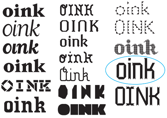
I started by looking at the word, “oink,” in a bunch of different typefaces. I cast a wide net so some of the fonts are pretty wacky. I was hoping to find something that would inspire me to go in a hand-drawn type direction. Some of these fonts I own but some are from a great site with free, downloadable fonts called Fontstruct.

Lots of wacky fonts. There are no wrong answers in font-storming. The font circled above became the inspiration for the new logo.
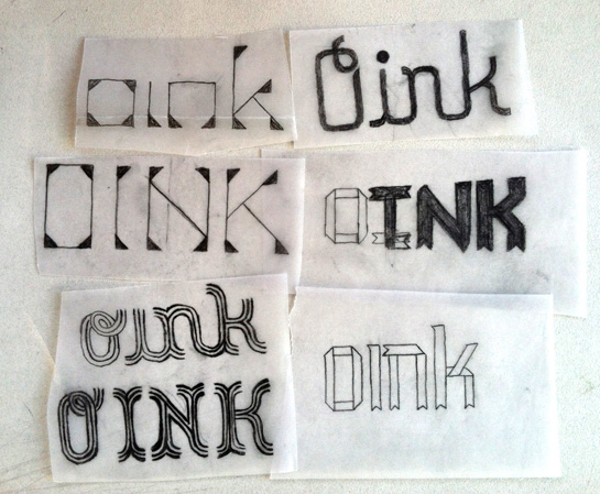
After trying out a bunch of fonts for inspiration I homed in on a font from Fontstruct called Arrowback. The arrowhead ends also look like pig hoofs and I like that it looks like it’s been folded.I played around with a sketches based on this font then decided to make it out of actual paper. Check out the video below!
The plan right now is to photograph the letters and add in some pigs that Liz, Ruthie and I have drawn. And I should probably add “pen &” at some point! Stay tuned for the new logo over the next few weeks.
Making of the Pen & Oink Logo from Robin Rosenthal on Vimeo.


