Last week, I discussed the design process for one of the posters in my (EXCITINGLY CLOSE TO ITS FUNDING GOAL) Kickstarter. Today, I’m going to talk about a relatively un-fancy way to make this sort of illustration yourself.

George and Martha: preseparated yet inseparable. (Pay no attention to the lady behind the picture book.) Photo: Jason Reigal.
I made color separations for my posters because they are going to be silkscreened by hand. But once upon a time, children’s book illustrators frequently drew this way–it made the books cheaper to produce. To my generation, this is sort of mind-blowing. A lot of us read Uri Shulevitz’s instructions for making preseparated artwork, in his excellent Writing With Pictures, with some bafflement. Why would we ever need to know how to do that?
Because it looks cool, that’s why. (More on my obsession another time.)
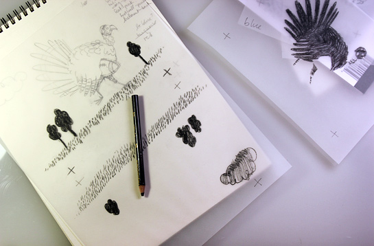
This project, like pretty much all design projects, started with a sketch. Thanksgiving is coming, so, sticking with the animals! playing sports! theme, the obvious choice was a turkey playing football.
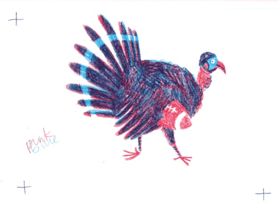
Once the sketch was sorted out, it was time to think about color. I used just two colors to keep things simple: light blue and pink. Remember, that actually means four colors: blue, pink, purple, and the paper (white).
I don’t think most illustrators do this, but: I tend to plan my colors in writing. That’s the list you see on the side of the sketch. (You’ll notice that I haven’t totally decided which colors to use.) I use this method with paintings, too, but it’s especially useful for this kind of project, which requires some non-intuitive planning.
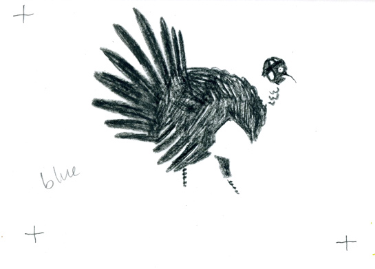
Those crosses are registration marks, for lining up the layers. I taped a piece of tracing paper* over the sketch, and drew new cross hairs. I labeled it with the color it would be: blue. Then, I drew, using my sketch as a guide.
I worked with a black colored pencil: I wanted to try a scribble-y look, but a regular graphite pencil tends to smear on tracing paper. I colored over all the areas that would be either blue or purple. When I was done, I labeled the paper “blue” and removed it.
Then I did the same thing for the pink layer, drawing registration marks and then coloring over the areas that would be either pink or purple.
There were also some places where I wanted a negative line. I drew those as separate layers, one for negative pink, and one for negative blue. Here, the drawn parts are areas that will be removed from each layer.
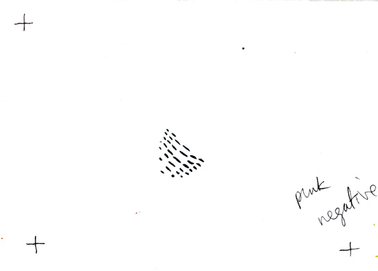 Then, I scanned all the layers and opened them in Photoshop. Scanned tracing paper comes out a bit gray, but I wanted clean white backgrounds. I used the Levels adjustment to fix that. (Layer > New Adjustment Layer > Levels. Either adjust the histogram sliders or select the white eyedropper and click on a place in the drawing that should be white, until everything looks good.)
Now came the fun part. I put all the layers in a single document and set each one to Multiply, using the registration marks to line them up. But they were still black-and-white drawings! So I used the Hue/Saturation adjustment, which is an easy way to turn a b/w image into a single color image. (Layer > New Adjustment Layer > Hue/Saturation. Check the “colorize” box and adjust the sliders to your liking.) I played around until I got a good color combination.
Then I dropped in the negative line. I put the negative blue layer just over the blue layer, inverted it (Command-I on a Mac), and made sure it was converted to a Clipping Mask (on a Mac: control-click > Convert to Clipping Mask; you’ll know because the layer will be indented with a little arrow pointing down). Finally, I set the negative line layer to Linear Dodge, which knocked out those lines from their corresponding layers. I did the same for the pink.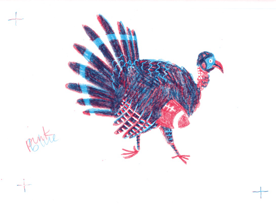 ***
***
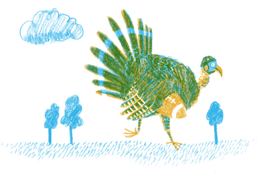
The nice thing about using the Hue/Saturation tool is that it’s really easy to change the colors.** I decided I didn’t like my blue and pink combo, so I changed it to blue and yellow.
But the picture didn’t feel finished. I realized it needed scenery. (In retrospect: duh.) So, I got some more tracing paper and made some.
Here are the finished layers:
And here is the finished illustration:
And that’s it! I’m ready for my tofurkey now.
CODA: You could, in fact, print these two layers on acetate and use them to make a silkscreen print. The results would be similar, except you’d have a real, physical thing on paper. Which is hard to beat.
—
*There are a lot of analog ways to make preseparated artwork: Rubylith, construction paper on acetate, regular paper + light box. I chose tracing paper because it is the simplest. Tracing paper won’t always work, though: what if you want to use paint? Or what if you want a grainy paper texture? Choices, choices.
**There are other ways. Again, this one is simple.
***For those paying super-close attention, I also made a few tweaks. Very few, though. Part of the fun of this process is accepting the accidents and mistakes that come along with such a rough way of working.

