

Above: An original painting for Swamp Angel written by Anne Isaacs, illustrated by Paul O. Zelinsky. Oil on wood veneer.
I was first introduced to Paul O. Zelinsky’s work when I heard him speak at the 2010 SCBWI Illustrator’s Intensive. I was inspired by the way his style changes depending on and in service to the story, so I was very excited when he recently agreed to speak with Liz and me at his Brooklyn studio.

Painting from the 1998 Caldecott Medal book Rapunzel by Paul O. Zelinsky (click to enlarge) “I’ve benefited a lot from practicing figure drawing. Spring Studio in SoHo is not so far from here. It’s figure drawing all day everyday and you just show up, but on certain days and times Minerva Durham, who runs it, teaches anatomy. That has helped me tremendously, whether I’m drawing a person realistically or making up a cartoon character.”
Paul received the 1998 Caldecott Medal for Rapunzel, and Caldecott Honors for three more books: Hansel and Gretel (1985), Rumpelstiltskin (1987), and Swamp Angel (1995). (You can see more of his work on his website.)
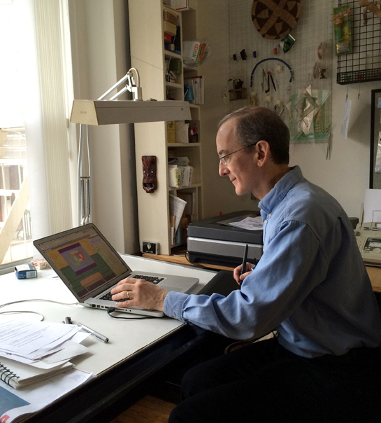
Paul at his desk pretending to use his computer.
The Scoop on Paul O. Zelinsky
Hometown: Wilmette, Illinois
Now lives in: Brooklyn, NY
Tools of the trade: You name it. I have lots and lots of brands of many kinds of paint and other media. I get Staedtler (black) pencils for no good reason; generic nylon watercolor brushes because the fine sable ones have not lasted well for me; Arches 120 lb cold press paper is a fallback but I use others, too. Epson 10000XL scanner, Photoshop CS5.5, Epson SP2200 printer. Faber Castell Pitt artist pens, S and XS, for doodling, but I keep losing them. Faber Castell Pitt Compressed Charcoal extra-soft, for chalk talks.
Workspace: Studio apartment across from a churchyard in Brooklyn Heights
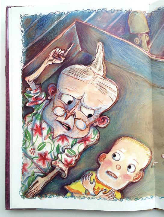
Book Trailers: Z is for Moose, The voice of the glove is Maurice Sendak. I hadn’t planned what was going to be in the trailer exactly and I didn’t know who he would be. I just said, “Would you record something?” [ED NOTE: You’ll have to watch it to see what Sendak chose to say.] I also created a few animations for The Shivers in the Fridge here and here.
Fun Fact: My recent hobby has been to fix on certain numbers that are interesting or significant to me, and to track the number of my Twitter followers until it reaches those numbers, feeling like I’m urging things on, as in a horse race. When my following was in the 1,000s there were lots of interesting dates to aim for; after the low 2,000’s that stopped being a possibility except for an occasional significant Star Date from a Star Wars episode. Oh, yes: my Twitter name is @paulozelinsky.
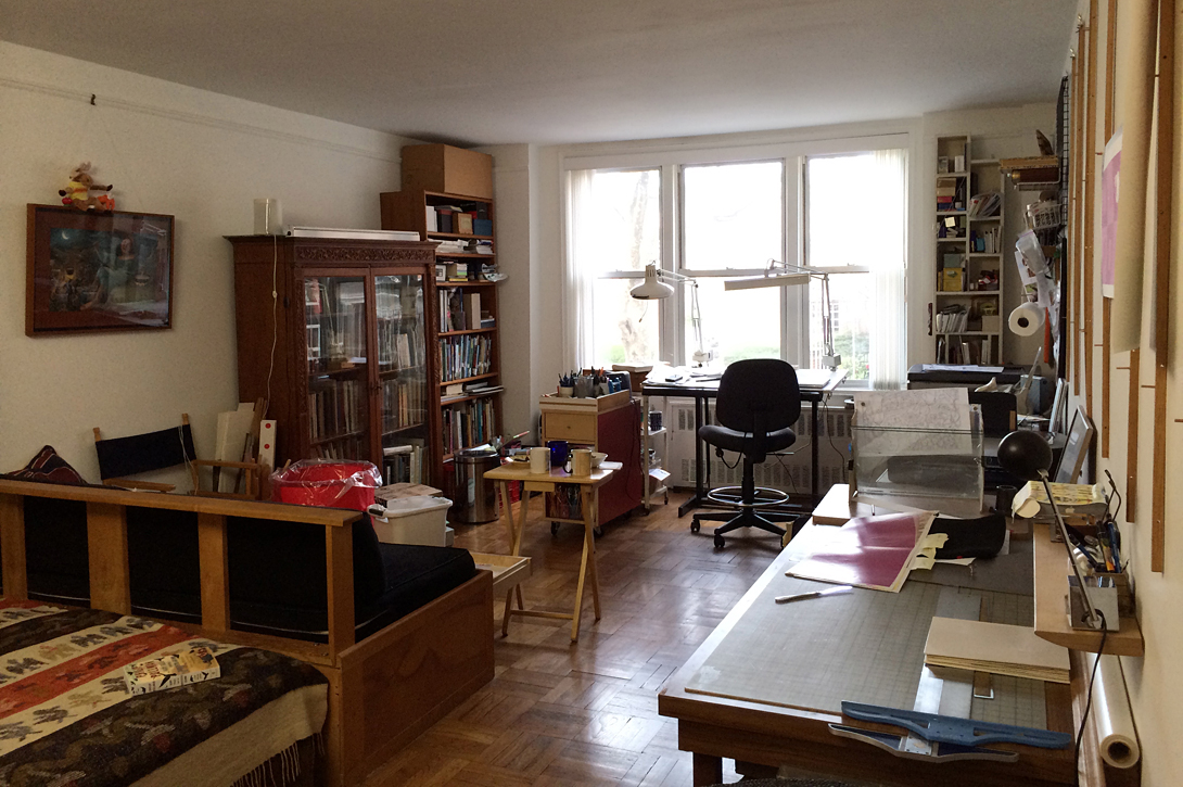
Paul’s studio in Brooklyn (click to enlarge)
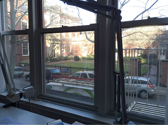
The view from Paul’s desk.
![From top: reference books, awards in the bathroom; pens and pencils; plugging up a hole with a coin. filling an empty intercom with a sketch; cards with original illustrations by Brian Floca, [name here], and Sergio Ruzzier](https://penandoink.com/wp-content/uploads/2014/03/paul-o-zelinsky-studio-details.jpg)
From top: reference books, awards in the bathroom; pens and pencils; a hole plugged up with an award; an empty intercom unit filled with a sketch; cards with original illustrations by Brian Floca, Rodolfo Montalvo, and Sergio Ruzzier
PO: Do you have a typical day? Do you try to get yourself on a routine or schedule?
Paul: Well, I get here. I try to get things done and then eventually I leave. That’s how I do it, ever since I moved out of my own live/work space in the distant past. My wife was a teacher [in Brooklyn] and our daughters were in school so everything started at 8:00 AM. But I’ve always been a night person. After many, many years I’ve trained myself to wake up and get here in the morning, but it doesn’t follow that my working brain would shift to the morning. Whatever I can do before late afternoon is usually very inefficient. And every time that I come back to work after dinner or just stay here and go until really late I think, why don’t I always do this? This is so good! But typically I only spend days at the studio. I’m not very routinized. I try to get stuff done.
PO: What are you working on now?
Paul: I just finished the second moose book. It’s a shape book called Circle, Square, Moose. It’s in proof right now. I’m hoping to make a trailer for the book then I’ll start Emily Jenkins’ next picture book.
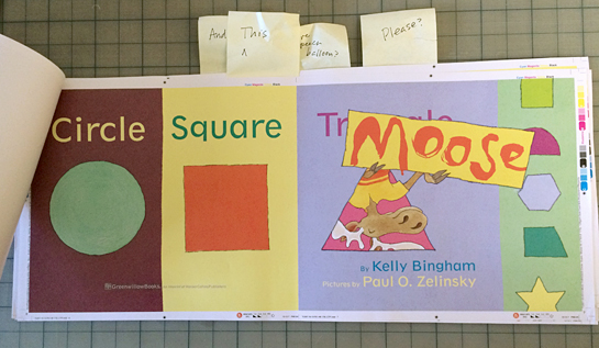
The title page, in proof form, for Circle, Square, Moose by Kelly Bingham, illustrated by Paul O. Zelinsky.
PO: You use a variety of distinct styles that change from book to book. When an editor comes to you with a manuscript how much say do you have in the illustration style that you use for the book? Do they come to you and say, “Can you do this like Rumpelstiltskin?” or “Can you do this like Toys Go Out?”
Paul: I don’t actually think anybody’s ever asked that.
PO: Really?
Paul: I guess I’ve been lucky that way. Nobody’s said, that I can remember, please do this like that. I guess publishers have known from pretty far back that maybe they’d be surprised. And maybe they’d be pleased. I have reworked things when they weren’t pleased, but in those cases there’s been a discussion of why something wasn’t working and I’ve been convinced that they were right. That’s usually how it works.
PO: So once you’ve read the manuscript do you just start experimenting with different techniques?
Paul: Yeah, sometimes I know what I don’t want to do and that’s all I know. But it helps. If the story isn’t telling me where it wants to go then I’ll try different things. It’s pretty clear I like finding approaches to my books by thinking of art and the history of art. I think about those images more than about pictures by illustrators per se.

The Shivers in the Fridge interior illustration (written by Fran Manushkin and illustrated by Paul O. Zelinsky)
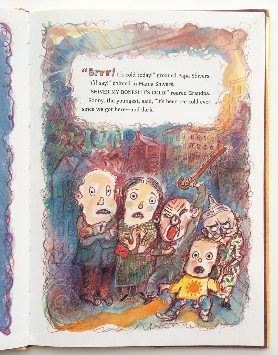
The Shivers in the Fridge interior illustration (written by Fran Manushkin and illustrated by Paul O. Zelinsky)
PO: Speaking of art history, the illustrations in The Shivers in the Fridge are so expressive. When you got that manuscript did you immediately think German expressionism or was that more of a subliminal influence?
Paul: I’m not sure. I knew I didn’t want to make the characters round and simple and classical-looking. It would be too much like Toy Story, for one thing. So I went the other way. My editor liked what I did but I think there were other people in the house who said, “Why doesn’t it look more like Toy Story?” I thought this text was too crazy to be illustrated in a realistic way, and tried to make the pictures crazy, too.
PO: So do you think your editor went to bat for you on that? Did hear anything about it?
Paul: If there was contention, I didn’t hear about it, because I had a wonderful editor. A lot has changed in the power structure of publishing but in the end it’s the illustrator’s drawings that are in the book, and the illustrator’s name on it. Sometimes I think illustrators are more timid than they need to be. I think it happens a lot that an editor or an art director will say something and the artist will think, “I have to do this because the editor said it,” when it could have just been the beginning of a discussion. Editors don’t mind a conversation. And they can be wrong. If you disagree strongly about a suggestion or a criticism you should say so. In one sense, everyone is on the same side– the side of making the book as good as it can be. But there has traditionally been an attitude in children’s publishing that the people making the art are Artists, and deserve special respect. From what I hear, that tradition may be wearing thin in places. That would be too bad. Not only because it’s so nice for an artist to be the recipient of great respect, but also because it’s an attitude that actually makes your work come out better. At least in the long run. At least I think so.
Detail of an illustration from The Shivers in the Fridge
PO: I have a very specific question about that The Shivers in the Fridge. I loved how you used a reddish purple color for the line work throughout the book instead of a black line. Did you start with black and then change it to that color? Was that just sort of an experiment?
Paul: It was a pencil drawing that I scanned and printed. There was something so serious about all of the black. I changed it from black to red in Photoshop. It looked much more lively and just felt lighter.
Detail from Rumpelstiltskin by Paul O. Zelinsky
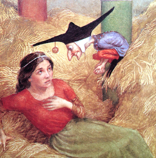
PO: Were you inspired by specific Renaissance paintings for Rumpelstiltskin and Rapunzel?
Paul: For Rumpelstiltskin I was just inspired by the sense of style and shape and light. I was looking at paintings but I wasn’t copying anything. For Rapunzel I decided that I would actually use specific poses and specific things from particular paintings.
I saw a painting—Portrait of Agatha Bas by Rembrandt—that I thought just encapsulated what I would like to have as a figure on the cover of Rapunzel. There was a woman inside an arched trompe l’oeil frame. She had one hand on the side of the frame and a fan in the other hand. The fan was sticking in front of the frame and her pose expressed a really interesting “come in here/get me out of here” duality. Also her gaze was unbelievable. I thought, oh, if I could only do that, but I’d have to copy Rembrandt’s picture. And then I thought, well, that’s what they did in the Renaissance. They copied. Art was a library of stock images. Greek sculptures were especially popular.
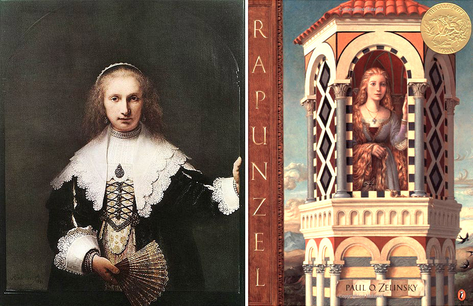
Left: Portrait of Agatha Bas by Rembrandt; Right: The cover for Rapunzel by Paul O. Zelinsky (click to enlarge)
I was also looking at Renaissance art for inspiration for what the prince would be wearing. I found it in a painting: Altarpiece of the Saints Vincent, James and Eustace by Antonio and Piero Pollaiuolo. One of them was wearing a cape and I really liked the way it had sheepskin on the inside and velvet on the outside, but I couldn’t tell from the reproduction what this piece of clothing would look like from the back. A stage designer friend put me in touch with a costume historian and we faxed back and forth. She sent me six pages from a book of costumes, which helped.
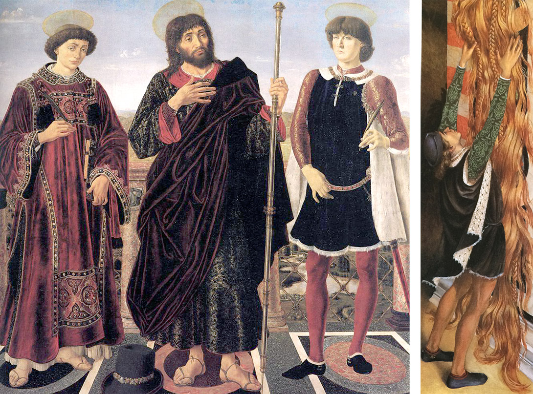
Left: Altarpiece of the Saints Vincent, James and Eustace by Antonio and Piero Pollaiuolo; Right: Paul’s prince in Rapunzel (click to enlarge)
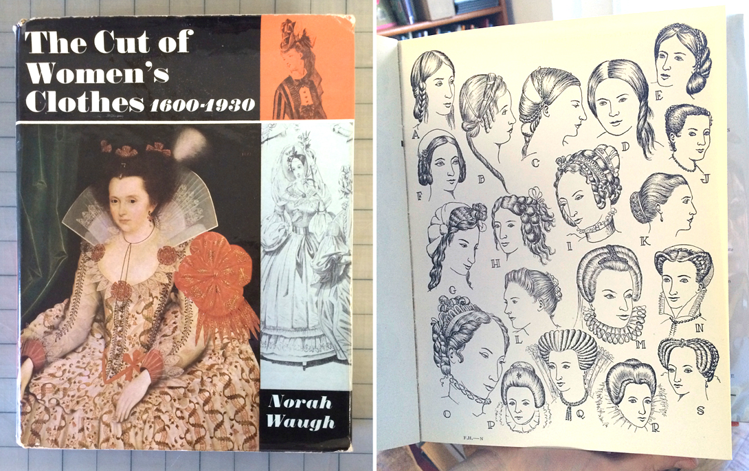
Costume design reference books: The Cut of Women’s Clothes and Fashions in Hair
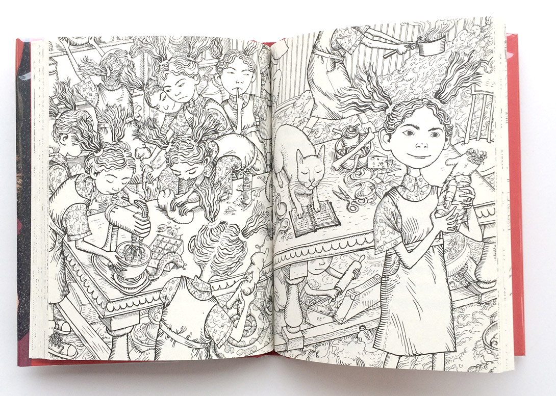
A spread Paul illustrated for Earwig and the Witch by Diana Wynne Jones. (click to enlarge) “She never got to see anything I did [for this book before she passed away], which made me sad. I was so proud to be illustrating her book, though it had a different illustrator in Britain. Diana Wynne Jones was my older daughter’s favorite author for years..”
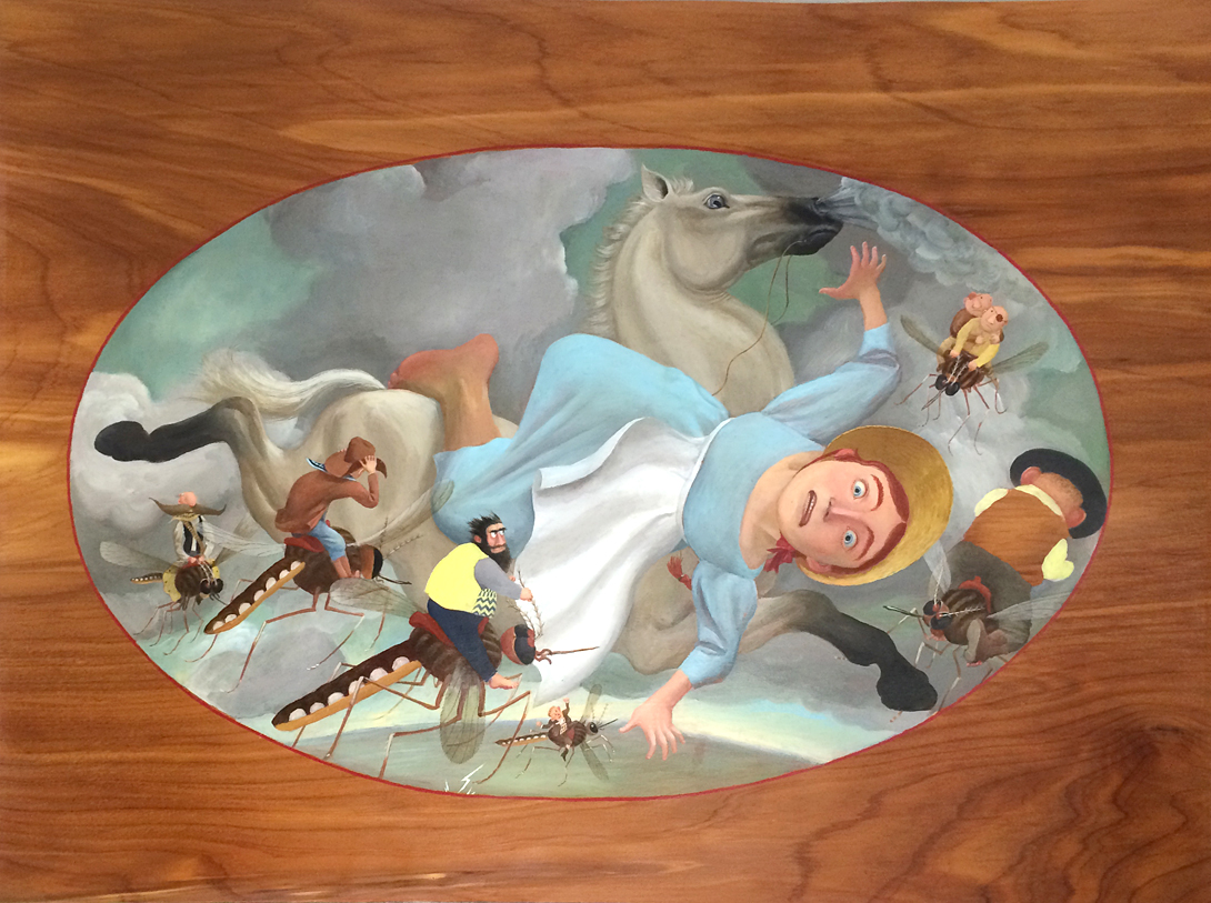
An original painting for Swamp Angel written by Anne Isaacs, illustrated by Paul O. Zelinsky. Oil on wood veneer (click to enlarge)
PO: How much time does using oils add to the process?
Paul: I’m sure it takes more time. For my most classical-looking books I was simulating the Renaissance oil painting technique, which has an underpainting and then an overpainting. The underpainting is gray monochrome, and all the hues get put on top of it transparently in the overpainting. Van Eyck I think was one of the early ones to work that way, building up rich colors with glazes. My underpainting was watercolor because it was quicker.
PO: How has technology affected your work? There have been some changes in printing technology since you’ve started, and I also see that you like to experiment.
Paul: I welcome the changes. Printing has gotten much better. I have always liked finding technological solutions to things. Full color [camera-separated cmyk] printing existed when I started but if you weren’t established then you weren’t budgeted for full color. You would have to pre-separate art and you had to try to figure out a way to make it look decent using only two or three colors of ink.
I didn’t want to do that. I wanted to have four colors of ink and it wasn’t that much more expensive to put in a fourth color with pre-separated printing. It was just a lot of work. I did two very elaborate four-color, pre-separated books trying to make it look like they weren’t pre-separated.
It was tricky. You have these four complete drawings for each picture in the book, and it’s just gray all over the place. You can’t tell by looking whether you’ve done it right; you have to think it out. That light gray where the bunny’s nose is– yes, it’s right, because it puts a little yellow into what would otherwise be purply pink. But if on the same piece you forgot to paint gray where on one of the other drawings there is gray grass, you may end up with grass that’s not green but blue. There usually wasn’t enough money in the budget to shoot and proof for this kind of mistake. So I thought, is there a way to to mimic the printing process? I thought of rigging something up by double-exposing color slides. If I could get slides to come out showing an ink color where the original was gray, then overlaying all four might simulate the printed picture. This crazy scheme actually worked. I took a slide of a piece of Pantone magenta paper, then double-exposed it with my magenta separation (which was all black, white and gray), and the developed slide, instead of going from white to black, went from white to magenta. And the same for the other three colors (the black separation I didn’t double-expose). I then took the four slides out of their cardboard frames and sandwiched them together, and lo and behold: not perfect color but good enough to see the mistakes! I came up with this Rube Goldberg process after my editor and I went through real torture color-checking the separations for The Maid and the Mouse and the Odd-shaped House. I used it for The Lion and the Stoat.
[ED NOTE: check out Liz’s great explanation of pre-separated art for more background on this printing process.]
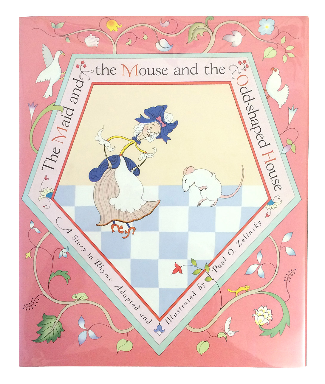
Cover for The Maid and the Mouse and the Odd-shaped House by Paul O. Zelinsky. For this book, Paul simulated the full color, camera-separated printing process with pre-separated art.
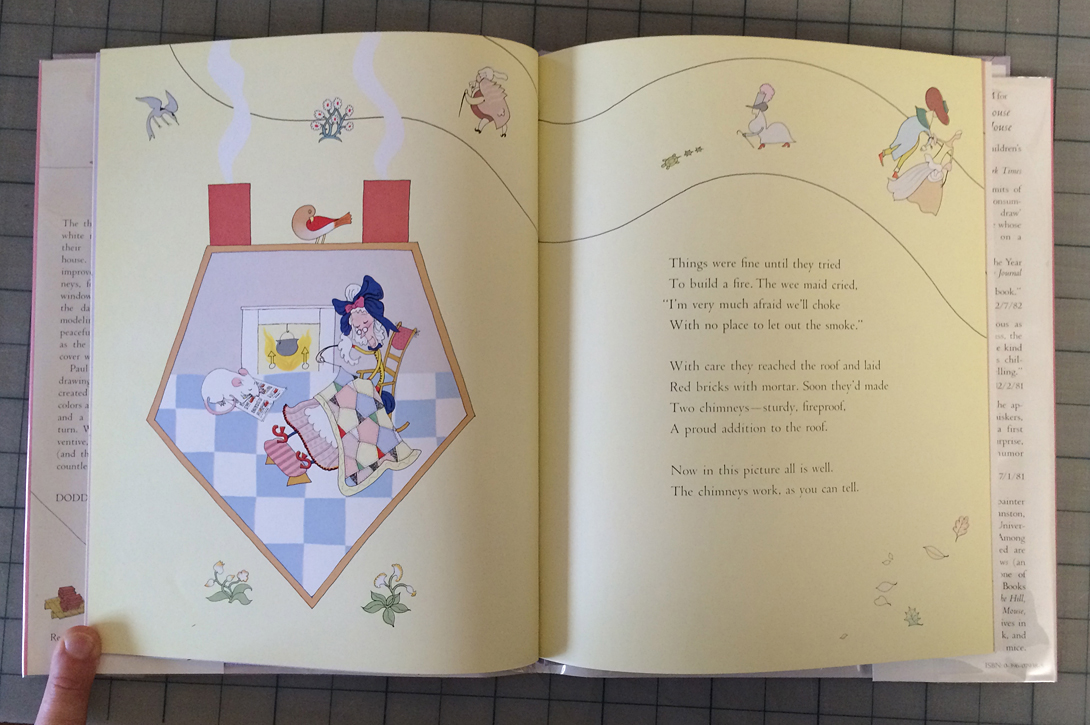
Interior spread for The Maid and the Mouse and the Odd-shaped House by Paul O. Zelinsky (click to enlarge)
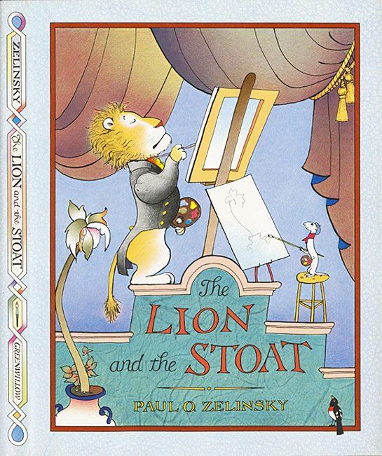
The Lion and the Stoat by Paul O. Zelinsky. This is another book that simulates full color, camera-separated printing with pre-separated art.
PO: That’s so much further than most people would go. You sound excited about the process, not just the finished piece.
Paul: Yeah, I like trying to find tricky solutions to things. And I am really happy when it works. I am also aware of how ridiculous I can get. Once I started using computers, it all fit right in with the way I was figuring stuff out before that.
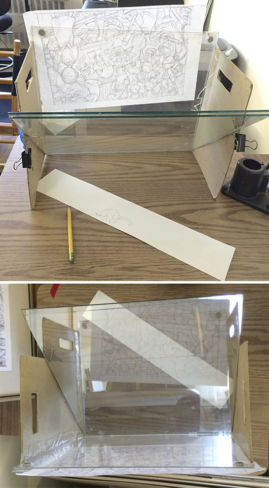
Paul’s invention, a tracing box his friends call the Zelinskograph
PO: Is this another one of your homemade solutions? (see photo above)
Paul: I came up with this idea when I was starting the paintings for Dust Devil, where the type had to fit in the art very tightly. I would draw outlines on my wood veneer and paint as carefully as I could but as I painted, things seemed to move around and the type didn’t fit with the image anymore. There was no way to see, while I was painting, where the type was going to go. I couldn’t lay down an overlay because the paint was wet. I couldn’t put the type behind the art on a light table because the wood and the paint were opaque. So I thought, I need something projecting from the front. An actual projector wouldn’t do it, I knew that. So I thought of this device.
It uses a half-silvered mirror I found online (it turns out to be a teleprompter supply). You slip some paper between the two vertical pieces of plexi—a drawing of what you want to trace, or in this case paper with the printed type—and, if it’s set up right, what’s on the paper appears to sit the on your artwork exactly as if it were printed or drawn there. If you adjust the lighting so that there’s more light on the paper in the plexi, or more on the work on the table, you can effectively make the reflected image appear or disappear, or find any stage in between.
PO: Is this something that existed before?
Paul: It probably has existed, things like it… I just called it my tracing box but then Sergio [Ruzzier] said that it was really a Zelinskograph.
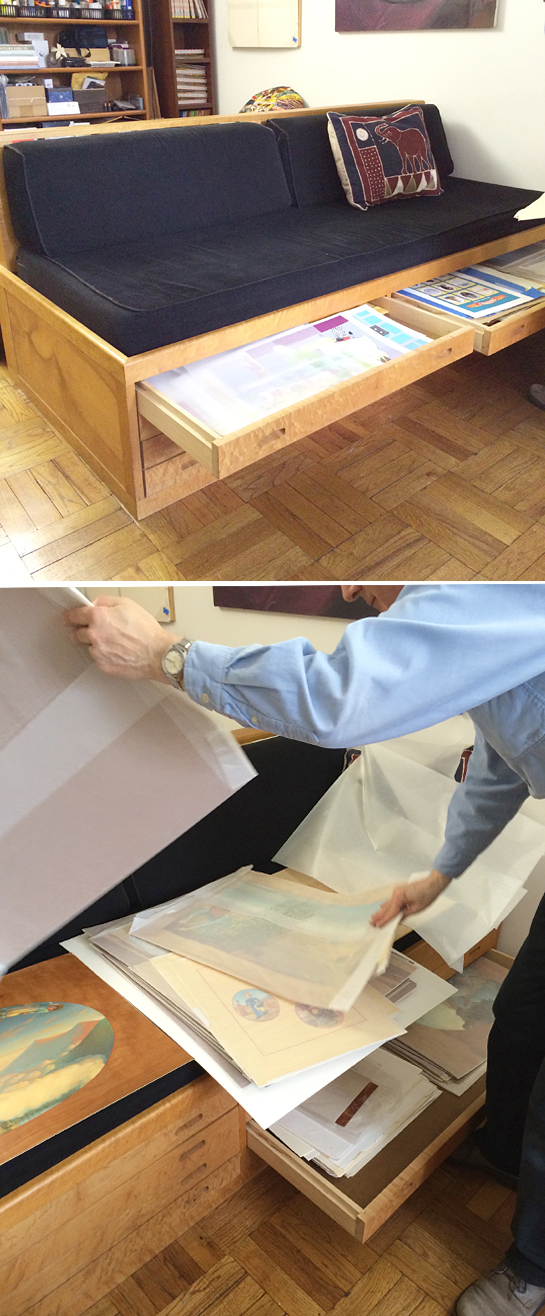
Paul’s custom made flat file couch. “I had this made after my first book that sold sort-of well. I had a friend who made wooden boats build it.” He keeps lots of his originals in here.
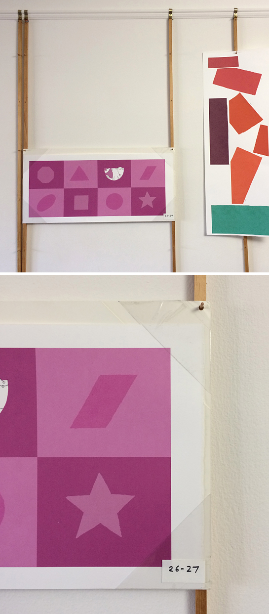
Another invention: Paul’s artwork hanging system.
PO: Are you using Photoshop much in your work now?
Paul: It depends on what I’m doing. For the Toys Go Out books, there’s not a computer in sight. The Z is for Moose book was supposed to look like that really boring alphabet book from when I was growing up, something which would probably have been done with airbrush at the time. I made the backgrounds in Photoshop and printed those out on watercolor paper. Then I colored in the characters with watercolor. I turned it into stuff that was physical art and it all had to be scanned, but some of what was being scanned had already been scanned and printed. People are doing that quite a bit now.
PO: Yeah, that seems to be popular: you scan your line work, print it on watercolor paper and then add your color. Did you do that for the Awful Ogre books? Did you scan your pen and ink and then do your watercolor on top of that?
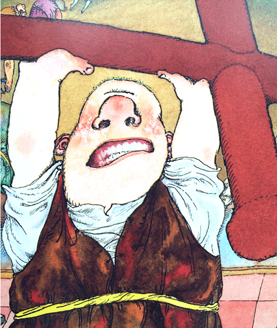
A detail from Awful Ogre Running Wild by Jack Prelutsky illustrated by Paul O. Zelinsky (click to enlarge)
Paul: The first Awful Ogre book —Awful Ogre’s Awful Day by Jack Prelutsky—came before I could have done that. I used my photocopier at the time, a big Canon machine. It had great blacks. It used powdered toner like a laser printer but it was analogue, with impressive line quality. Toner repels water, so when you have your printed black line drawing and add watercolor it holds it within the outlines. It’s incredible. Watercolor on top of regular black ink weakens the blackness of it. You’d have to go back over the lines with more ink if you want them to have that punch of the copier’s printing.
By the time I was illustrating Awful Ogre Running Wild my copier had gotten old—no more black blacks and it put tone down on the whites. But now laser printers could print almost as well as my copier once did. At Greenwillow Books their printer was pretty good and I found that if I didn’t completely finish my line drawings before scanning them, and added some actual pen and ink here and there at the end—you know, just some fine details—that really eliminated the copied quality of the lines.
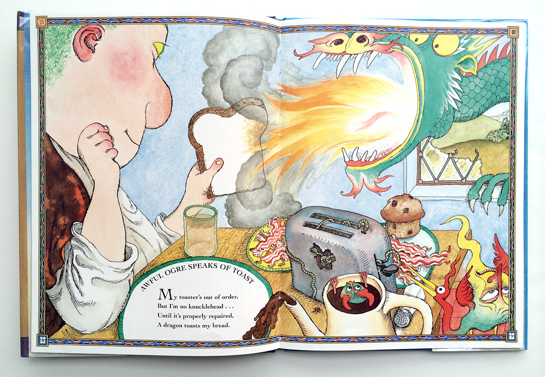
A spread from Awful Ogre Running Wild by Jack Prelutsky, illustrated by Paul O. Zelinsky
PO: You have worked with so many different media in your work. Do you have a favorite medium that you work in and a least favorite?
Paul: I don’t really… but I wrote something for the Horn book a few years ago about why I use oils so much. Since that piece came out, though, what you can do with computers has changed a lot, and what I can do with computers has changed even more, so my view of computers should definitely be revised upwards. But there’s still nothing like good paper and good paint for making art!
____________
Thanks for sharing all of your great insights and work with us, Paul! We’ve only scratched the surface of Paul’s oeuvre so head over to his website to see more.

What a great interview! Love Paul and his work! Thanks for sharing.
LikeLike