It’s no surprise that an art director’s main source for finding illustrators is the good ole world wide web. Art Directors look at hundreds of websites a year so naturally they have some strong opinions about what they love and what they hate about the sites they visit. I polled several of my art director friends and we came up with some online portfolio dos and don’ts.
Don’t freak out if your site is more “don’t” than “do”. If an art director loves your work, she’ll most likely want to work with you regardless of what your site looks like. In fact lots of amazing illustrators have kind of crappy websites. That said, if you have a simple, well-considered and well-edited website, your work will shine, you will look professional, and you will make your potential future art director very happy.
_________________________________________
Don’t make us work to see your work. We want to see your work as quickly and easily as possible. My motto is “more scrolling/less clicks.” I much prefer scrolling through images to clicking on lots of teeny tiny thumbnails or numbers to move through a portfolio.
Do make it easy to navigate: Make your menu clear and divide your work in a meaningful way. Make it easy for us to move from project to project. “I’m a fan of a simple gallery. I don’t like work organized in a million sections unless the work is so different that it warrants that,” says Rex. Melinda Beck works in variety of styles but her menu and site design are so clear it’s easy to navigate.
Don’t use tiny cropped thumbnails: These abstract little bits don’t tell us anything about what we are about to see when we click. “You’ve got the space to elegantly show the entire piece rather than some obscure, misleading snippet,” says Jas.
Do show representative thumbnails: “Lately i’ve been appreciating thumbnail previews, not
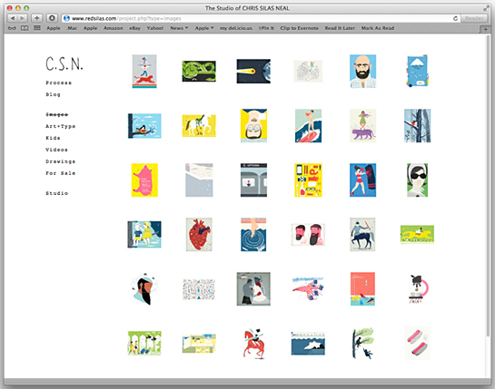
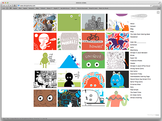
cropped thumbnails, but a thumbnail of the entire piece to then decide if i want to see it larger,” says Michele. Chris Silas Neal shows us a gallery of thumbnails of entire pieces that we can click on and navigate through easily. Andy J. Miller crops his work a bit in his thumbnails, but we see enough of it to know what his style is like and we have an idea of what we will be seeing when we click on the thumbnail.
Do put your best work first: “I can usually decide within 3 or 4 images if it’s the right person for the job,” says Rex.
Don’t show it if you don’t love it: Chances are, if you think a piece is weak, the art director will probably think so too. The art director wisdom goes like this: don’t hire an illustrator if you aren’t happy with your least favorite piece in their portfolio.
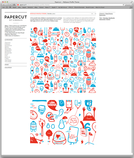
Make the work big enough: We like to see your illustrations at a decent size. We often need to print them out to show our editors or put together a comp with it. We also like to see the nuances of your technique. Show us details of the piece if it is complex. Papercut does a nice job with this on their site.
Do update your work: “A new or recent link keeps us coming back for more,” says Jas. Along these lines, choose a portfolio format that allows you to update your work easily.
Do make it easy to contact you: We shouldn’t have to hunt for your contact information or go to another site, like your blog, to get it. Also, if you are going to be out of the office for a while, set up an out-of-office email message. It’s a real bummer to contact an illustrator that we are excited to work with and hear nothing back and not know why.
There are a lot of great online services an illustrator can use to create a beautiful online portfolio site without a web designer. My current favorite is Cargo. It is easy and intuitive to use, the online support forums are great, and there are lots of great templates to choose from. Eric Smith, Merjin Hos, Andy J. Miller and Chris Martin all have great, simple sites of Cargo.
Whose portfolio sites do you think work really well? Art Directors out there: any more tips?
Special thanks to art directors Michele Outland, Jaspal Riyait, William Van Roden, Rex Bonomelli, and Jenn McManus for their input on this post.


ben javens also has a nice Cargo site!
http://benjavens.co.uk
LikeLike
thanks, Robin! this is exactly the insight i needed to start working on my redo!
LikeLike
That “Rex” sounds like a jerk.
LikeLike
Pingback: Portfolio Bears «
Pingback: Rounding up posts at the old Pen & Oink ranch |
Superb post– thank you! : )
LikeLike