MNMLSM

Favorites / Foreign Exchange
dick-bruna-umbrella

Image: Dick Bruna

I’m really into bold, minimal, modern, poster-y illustrations right now, which I guess is what happens to your brain when you start working in silkscreen. Even though I think of myself as a maximalist, like LET’S PUT IN LOTS OF TINY DETAILS EVERYWHERE IN SCRITCHY SCRATCHY LINE. This modern stuff is more Robin or Ruthie’s bailiwick (Exhibit A: our avatars), so it feels a little funny to write this post. But BRIGHT COLORS and SHAPEY SHAPES, I must have you.

Some years ago, Ruthie introduced me to the work of Dick Bruna, creator of the little bunny Miffy, or Nijntje, as she’s known in the Netherlands. Believe it or not, in Utrecht there’s a whole museum devoted to Dick Bruna, where I learned that he is an utter perfectionist about his drawings, his palette (a few very specific colors) and the printing of his books. It kind of endeared him to me. Bruna was influenced by De Stijl.

dick-bruna-beardick-bruna-miffy-toys

dick-bruna-miffy-bike-woods

Erin Jang is a New York-based illustrator who makes a lot of great paper goods.erin-jang-abc-poster

erin-jang-gumballs

erin-jang-naomi-laughs

Leo Leonni:

leo-leonni-blue-yellow

Paul Rand, designer of mid-century logos for IBM, Westinghouse, and others:

Praia_capa.indd

Olimpia Zagnoli, an illustrator based in Milan:

olimpia-zagnoli-knight olimpia-zagnoli-submarine-love

I know I’m just scratching the surface. Got any favorites you’d like to add to the list?

Portfolio Bears

Show and Tell / Thoughts

So over the next week or so I’m trying to redo my portfolio website which is in grave need of some serious lovin’. Luckily, Robin gave us some great tips in her post about what Art Directors are looking for in a portfolio. Read More

A Pen & Oink interview with Liz Tardiff, in which she covers book covers

Interviews

lullaby-for-a-black-mother
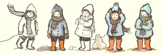
Today’s interview is something a little different: our first with a children’s book designer! Read on for an interesting look at the work of Liz Tardiff, who’s with Houghton Mifflin Harcourt. People, if you’re writing a book about the circus for HMH, don’t expect the cover to be typeset in Rosewood.

THE DIRT ON: Liz Tardiff

Hometown: Blackstone, MA (Usually that is qualified with: “Well, I grew up in MA but my family is from Maine…”)

Now lives in: Brooklyn, NY (A simpler answer!)

Tools of the trade: I mostly work in InDesign, Photoshop, and and Illustrator, but I’m on MyFonts all the time looking for typefaces.

Illustration idol: I love Sophie Blackall, John Hendrix, Sean Qualls, and too many others to list them all!

Caffeine of choice: Caffeine usually makes me twitchy, but I sometimes go for Earl Grey tea.

Favorite children’s bookpull-quote

…as a child: Ramona Quimby, Age 8, Wise Child, and Corduroy.

…as an adult: I still love Ramona and Wise Child! My Friend Rabbit is another favorite picture book.

Favorite thing to read: I like to read nonfiction books about science, food and nature interspersed with children’s books and adult novels…keeps things interesting.

YouTube video you can’t stop watching: I’m sure everyone in the world has know about this for years but I love this video. Look at this horse!

Must-read blog: I’m semi-obsessed with food blogs.  My favorite blogs at the moment: Smitten Kitchen, Orangette, Paper and Salt (authors and food!). I also check Design Sponge, the Jealous Curator and Pinterest often for design/art ideas.

What’s your role, as a children’s book designer, in the life of a book?
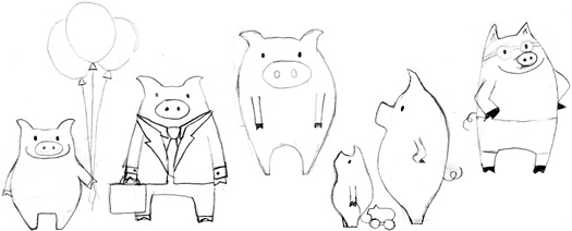
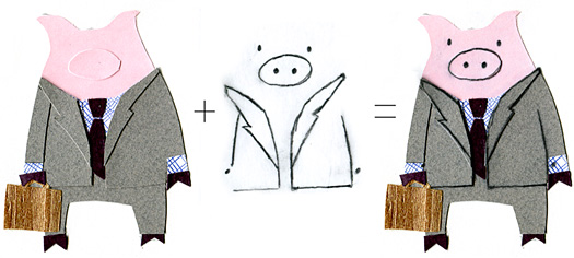
Mthe-lightning-dreamer
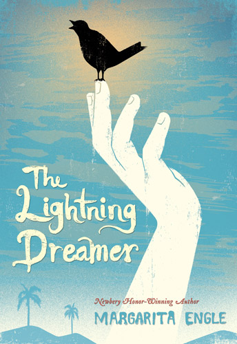
y role is different for picture books and novels. When I’m working on a picture book I lay out a dummy so the editor can see how the story is flowing through the page breaks and I place some type so I can get a feel for the typeface and point size that works with the book. There are usually several dummies as the editor continues to hash out the details with the illustrator and author and me and then we have the illustrator go to final art. I help art direct the cover and then do the layout and type design for the jacket.

The novel process is different. I come into that towards the end when the manuscript is transmitted and is in the last rounds of edits. I read the manuscript and start working on cover concepts. It might end up being something that I create out of stock images or I’ll hire an illustrator and will art direct and design the type. I show the art director and the editor and then we bring the cover comps to a larger cover meeting that includes sales and marketing. It can take a couple of rounds (sometimes many!) to get approval. Once the cover is final I start laying out the rest of the jacket and work on the interior design.

Could you clarify the difference between a book designer and an art director?

I’m a senior book designer so I do all of my own art direction for novel jackets (meaning that I communicate directly with the illustrators as they move forward with sketches and final drafts) and I work with the editor on the art direction for picture books (in our publishing house the editor usually contacts the picture book illustrator with both of our comments). The art director is a step or two above a senior designer (there are also associate art directors) and they have more experience in general. I still go to my art director for advice and approval. Often art directors or creative directors will influence an imprint of books with their style, but that’s not always the case.

How did you get started designing books?

I studied art history and visual art in college and then ended up at the Children’s Literature graduate program at Simmons College a few years after I finished undergrad. I was interested in design and I loved children’s books so I was thrilled to get an internship at Bedford St. Martin’s where I started learning about publishing and the basics of book design. I had another internship at FSG in New York and then got my first job as an assistant at Henry Holt. I’m grateful to have found a job that combines so many of the things I love.

Do people have any misconceptions about what you do?

Yes! Often when I tell people that I’m a book designer their faces light up and they ask me if that means that I illustrate books.

It’s always a little sad to see their faces fall when I tell them that book design is mostly graphic design and typography. I guess illustrators are just cooler to meet at a party! [We are pretty cool. -Ed.]

How do you go about matching typography with illustration?

That’s an interesting question. I think it’s a little different for each book. If it’s a historical novel or picture book then I start doing research on the design of that era so I can get a feel for the type of that time period. If it’s a modern novel then I look through the fonts that we own or start searching through MyFonts for ideas that suit the tone of the story.

type-samples-stacked
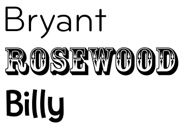
Any favorite fonts these days? Any you never want to see again? 

I like Bryant for a nice clean sans serif and I’ve been going through the fonts on Letterhead Fonts recently for a new novel cover I’m working on. There are some really beautiful fonts on that site. As for fonts I’m sick of? I could do without seeing Rosewood for a while—seems like it was everywhere a couple of years ago. I see Billy used a lot too, but I’m not sick of it yet.

Does the illustrator have any input on the design of the book?

Yes, at our publishing house they have input if it’s a picture book. We run the font choice by them before we finalize it to make sure the illustrator is happy with it (although they don’t always get a final word on font choice) and the cover design goes back and forth a lot as we figure out the illustration and the type.

For novels, the cover illustrators don’t usually see the font choice since it happens after their work is done.

twice-upon-a-marigold-cover
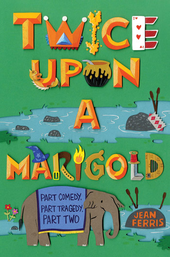
I really loved the Once Upon a Marigold covers you designed! Could you talk about those?

The Marigold series was an interesting journey. We had an established series design from several years ago that I needed to freshen up while retaining the basic elements of the look. I started doing A LOT of comps for that title as I tried to figure out how to tie it to the series while making it look more modern/fresh. Thankfully the book bumped a season and I had more time! The comps were just not working so the editor and I talked again and it turned out that the paperbacks for the first two books were going to be reprinted at the same time as the new hardcover so I could do a full redesign. This was good news and I had an illustrator in mind. Jared Schorr was available to do the assignment and we rushed into getting all three covers done at once. It was fast! He was a trooper. He hand-cuts everything and layers it on the paper so that the shadows are all real (amazing!). It took several rounds to get it right and to make everyone happy with the readability of the letters but once they were done we were all very happy with them. I think they suit the books and I hope fans of the Marigold series will enjoy the new look.

Tell us about some other recent books you worked on. 

This past season I worked on a lot of picture books that I’m really excited about! There’s a new book coming out from Sean Qualls, which is always a good thing. He illustrated a Langston Hughes poem called Lullaby (for a black mother) and the cover and interior are lush and layered and really beautiful. That was a pleasure to work on. And there’s a Beatles picture book that will come out this spring too called The Beatles Were Fab (and They Were Funny) that was great to work on. The illustrations are by Stacy Innerst and I’m really happy with how the cover came out.

Beatles

 Describe your dream project.

Hmmm. I think it would be a small, quiet, literary novel (could be either middle grade or YA) where I have free rein with the cover… Maybe there are a few black and white illustrations for the interior too.

 Why children’s books?

Books were almost magical when I was a child so it’s a privilege to bring new books to children, even if I only help in a small way. I like knowing that they will go out into the hands of kids who will devour them and love them and grow up to tell their own stories.

Anything exciting in the pipeline?frogged

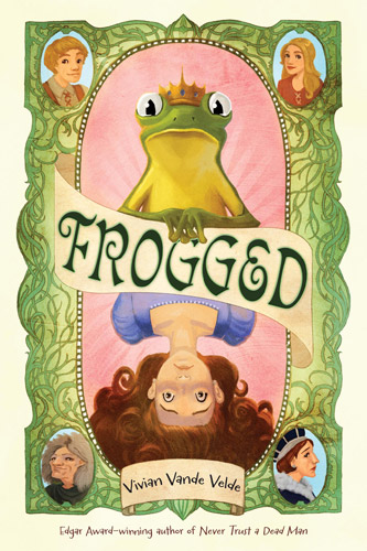
There are a lot of good books coming out this spring! Besides the ones I mentioned above there’s a new Margarita Engle book in verse, Lightning Dreamer and a new Vivian Vande Velde book, Frogged. I got to work with great illustrators on each of them and it was a pleasure! (Edel Rodriguez/Lightning and Erin McGuire/Frogged.)

AND FINALLY:

Celebrity death match: Dr. Seuss versus Mo Willems. Who wins, and why? I’m going to have to go with Seuss—his books are classics. Maybe I’m biased due to my undying love for One Fish, Two Fish…but it’s definitely Seuss for me.

Carosello Part I: La Linea

Animation / Foreign Exchange

Above: the opening Carosello logo from its Wikipedia page courtesy of RAI

“Guardi Carosello e vai a letto!” (You can watch Carosello and then it’s bedtime!) The famous phrase (or some version of it) Italian children heard for as long as Carosello was broadcasted on the RAI (Italy’s state television channel). My husband often shows me clips of this staple from his childhood in Italy. What I can gather about Carosello was that it was on TV from the late 50s through the late 70s, it was totally awesome, AND it was really just a bunch of commercials! In fact, it was somewhat of a “commercial break.” It followed the news which was generally at 8:00pm, which means it probably started around 8:45pm and lasted about ten minutes (I’m working off his memory, but also it was on for so many years that things changed too). And although it was just commercials, the content was often so creative and original itself everyone looked forward to it. It even had it’s own opening theme song. Here’s a compilation of the openers from over the years.

Read More

When Ruthie Tries a Pen & Oink Tutorial, the Raccoons Take Over.

Process / Tutorials
My copy of Frosty: a Raccoon to Remember by Harriet E. Weaver. This is a must for raccoon fans! True story!

My copy of Frosty: a Raccoon to Remember by Harriet E. Weaver. This is a must for raccoon fans! True story!

From time to time I’m going to try out Liz’s and Robin’s tutorials, especially since I have no known skills to do my own tutorial, unless it’s called: “How to Doodle on a Piece of Paper”.

For today’s post I’m going to try and tackle Liz’s very ambitious color separation tutorial (she also explains the technique more in general here). It scares me the most! It is so far from how I would ever approach a final piece. So here goes, Ruthie outta the box, “keepin’ ’em separated” Liz style. Read More

The Seamstress of Salzburg by Anita Lobel

Featured Books

On my 25th birthday my sister gave me one of the best gifts I have ever received. It came wrapped in a beautiful floral print. As I looked at the wrapping paper, I slowly realized where I knew that pattern from: the end pages of my all-time favorite picture book, The Seamstress of Salzburg by Anita Lobel. My sister had found an old library copy on sale on eBay and photocopied the end papers to make the wrapping. (Nice touch, huh?)

We never owned this book when I was growing up but I remembered constantly checking it out and renewing it from the library and poring over the incredibly lush images. I hadn’t thought about the book in a long time but when I saw it again that day it brought up so many feelings I actually started crying, then sobbing. In a good way. The palette of this book is so beautiful it actually makes my heart ache a bit.

End papers for The Seamstress of Salzburg by Anita Lobel

End papers for The Seamstress of Salzburg by Anita Lobel. Lobel was also a textile designer. It shows!

Title page

Title page for The Seamstress of Salzburg. The story is about an incredible seamstress, Anna, who sews and embroiders the most beautiful clothing. She is discovered by the noble ladies of Salzburg, who each commission her to make increasingly elaborate dresses so they can one up each other.

"Once in the city of Salzburg lived a poor girl Anna who loved to sew and embroider beautiful clothes."

“Once in the city of Salzburg lived a poor girl Anna who loved to sew and embroider beautiful clothes.”

(Click to enlarge.)

“Often she fell asleep over her work…” (Click to enlarge.)

"Everyone could see that the Queen's dress was falling apart at the seams." (Click to enlarge.)

“…Everyone could see that the Queen’s dress was falling apart at the seams.” (Click to enlarge.)

Read More

“Epigrams succeed where epics fail.”

Featured Books / Foreign Exchange / Indie Picture Books That Are Awesome / Show and Tell
quentin-blake-sago

“Even sago, used to exess, may cause harm.” Illustration by Quentin Blake, from Thoughts and Aphorisms from the Fruits of Meditation of Kozma Prutkov.

If anyone ever wants to buy me a wonderful and expensive present, I suggest a copy of Thoughts and Aphorisms from the Fruits of Meditation of Kozma Prutkov, a rare pamphlet illustrated by Quentin Blake in 1978. This post is not about the ever-wonderful Mr. Blake, however, but about quotations and maxims.

I write my own stories, which is sometimes great (more freedom!) and sometimes burdensome (more freedom!). In the worst cases, fiddling around with a piece of writing sometimes keeps me from getting to the illustration part. So I think it’s good to start with someone else’s words, sometimes. All the better if they’re anonymous, or plain, or never meant to be illustrated. Proverbs. Instruction manuals. Bits of folk wisdom.

These sorts of texts are appealing to illustrate because they leave a lot of room for interpretation. The way Quentin Blake has it, the text and illustration are a comic duo in which the aphorism plays the straight man.

quentin-blake-hussars-sm

“If you want to be beautiful, join the Hussars.” Illustration by Quentin Blake. The book shown above does not belong to me, alas. Photo from the bookseller, Roger Middleton.

Speaking of behavioral directives, I recently illustrated a piece on workplace etiquette for the FIT alumni magazine, Hue. That was fun, although the article neglected to address an important issue: when working in a home studio, must one wear pants?*

liz-starin-workplace-etiquette-hue-2

Are hats appropriate in the workplace?

liz-starin-workplace-etiquette-hue-1

What about flip-flops?

*People. I am not one of those pajama-wearing savages. PLEASE.

New Year, New Pigs

Process / Show and Tell
Final Swim Pig and and Business Pig. The style is a departure for me.

Final Swim Pig and Business Pig. The style is a departure for me. I upped the contrast of my original pencil  sketches in Photoshop and then colored them digitally.

Happy New Year everyone! We’ve got lots of great interviews, process posts, books, and more to share with you in the coming months.

In the meantime, I wanted to share with you the pigs I created to accompany our logo. For more about how I designed our current logo, check out this post.  (And check out Liz’s pigs and Ruthie’s pigs 1, 2, 3, 4, and 5.)

My initial pencil sketches

My initial pencil sketches

Business Pig in paper with pencil details overlaid in Photoshop.

A variation of Business Pig in paper with pencil details overlaid in Photoshop.

Mama pig and piglet. Only the piglet made the cut.

Mama pig and piglet. Only the piglet made the cut in the final logo.

German Ornaments

Foreign Exchange / Inspiration / Just Because
Santa with a tree and a sac.

Santa with a tree and a sack.

My parents lived in Bad Kreuznach, Germany for three years when they were first married because my father was stationed there in the army. Among other things (including my older sister who was born there!), they brought back ornaments for the tree with them. Every year growing up when we helped them decorate the tree, I would marvel at the hand painted wooden ornaments. Each one more interesting and colorful than the next. I would line them up, play with them and make sure my favorites got prime spots on the tree. They are over 40 years old, many other ornaments have come and gone, but these remain the only ones worth putting on the tree. I like how cheerful and odd they are. I was planning on posting something else for today, but after seeing these when I was home I wanted to share them with you. Read More

Interview roundup

Interviews

Dearest readers,

Pen & Oink is keeping things relaxed this weekend. But check out these interviews from our first three months! And enjoy your solstice holiday, whichever it may be.

-Ruthie, Robin, and Liz

abby-hanlon-ralph-teacher

“The first thing she asked on the phone was: ‘Tell me honestly, have you ever taken a drawing class?'” —-Abby Hanlon


Character studies for Lauren Castillo's THE READER

“I am more comfortable working at a small size—I’m able to create a more energetic line when I draw tiny.”—Lauren Castillo


Neil-Numberman-filling_the_well

“I always drew for kids when I was a kid, and my style never really changed!” —Neil Numberman


rob-dunlavey-dandelion-sparrow

“After my daughters were born in 1994 and 1997, I started working more diligently in my sketchbooks. I needed this personal time to keep my artist-self happy.” —Rob Dunlavey


Sergio-Ruzzier-Have-You-Seen-My-New-Blue-Socks-INTERIOR-4

“A good illustrator is a cheater: you need to betray the text, at least a little, if you want your pictures to be worthwhile. But it’s more difficult to cheat on yourself.” —Sergio Ruzzier


stephen-savage-little-tug-1

“A classmate of mine, Riccardo Vecchio, taught me the value of color in storytelling. He showed me how to create a “color script”— a grid containing all of the spreads of the book laid out in sequence.” —Stephen Savage (part one) (part two)


rebecca-emberley-scorpion

“I still use Freehand MX and they’ll have to pry that program out of my cold dead hands.” —Rebecca Emberley